

Kim Singletary is a scholar of Critical Race Theory, and an author of the book Blackness Personified: Images of US Blackness in Contemporary German Public Culture. She needed to promote her book while establishing a more long-term online presence that could support her in speaking at Universities and sharing frameworks of analysis. I believe that Kim’s work makes the world a better place, and I was honored to create a visual identity to help deliver it.
Deliverables



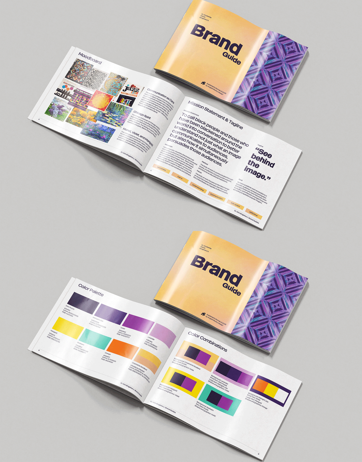





I begin every project by gaining as much information as I can about my client, their industry, relevant history, and current events. This is followed by an interview or workshop to solidify mission, vision, goals, strategy, positioning, and brand expression.
In Dr. Kim’s case, we explored her interest in opening academic discussion up to a wider audience while maintaining rigor and thoughtfulness. Visual influences included Monet paintings, the vintage Montreal Expos logo, and Tanner Adell.

I try to always follow Allan Peter’s advice and draw 100 sketches. It's harder than you'd think, but this time I got close! I also use watercolor to explore color and its relationship to form.
I also examined the use of iconography, although it did not end up being necessary at this time. Maybe in the future when the density of content increases, more indicators such as icons could be helpful.
Some inspirations that came during sketching and brainstorming;












Once we had a direction that felt strong, I refined it and applied the golden ratio. I found reflections of the quotation mark in the negative space, which aligned well with the brand value of reflecting what seems hidden on first glance.
The typography is inspired by Harper’s Bazaar, an American standard in cultural commentary and imagery that tells a story.
Touchpoints include;

Below are some time-lapse videos of work I did in Procreate. I personally love these videos, but they're currently un-edited, and there are some flashy moments when I'm turning layers on and off. Please take care if you experience epilepsy or light sensitivity.